I remember it being a revelation as a child when it was explained to me that the stats and the statistics in adverts weren’t always reliable. I knew that adverts weren’t allowed to just lie – otherwise what would be the point, but what I hadn’t considered was the way they could tell half truths, to exaggerate certain points or just to warp their statistics.
The most obvious example of this is ‘9 out of 10 customers enjoyed our product’ which means nothing when you consider that they may only have asked ten customers and they might all have been related to the CEO. The advert hasn’t lied, but that statistic doesn’t mean much at all. One that is even more amusing to hear is ‘clinically tested’ which couldn’t be more vague if it tried – sure it was tested, but in what way? And what was the outcome?
Understanding this is something that’s very useful when it comes to being a discerning customer and not giving all your money away to corrupt organizations. However it’s also useful if you are one of those organisations, or if for any other reason you need to create some statistics that will side with you.
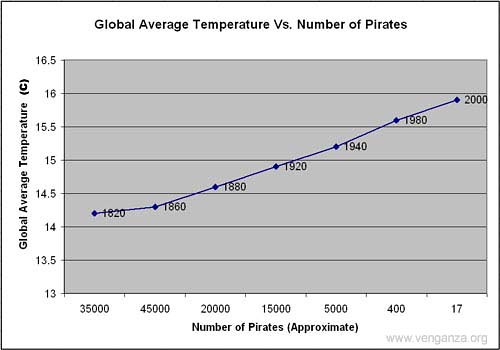
Graphs and charts never lie right? Well no they don’t, but you can choose which truths you want them to tell. Here are a few ways to present your information in a manner that makes it a lot easier to swallow.
Choose Your Time Period: One way to make your graph or your charts look better is to just choose the period that you want to show. If you are showing profits for instance then you might find that showing the whole year demonstrates a decline that really you’d rather people didn’t notice. One way to solve this is to just show how you made a significant increase in the first month, or to even extend the time period you’re working with over the last three years in which case you might find that you have increased overall – and a projection for the next three years would then be likely to go upwards as well overall.
Eliminate Outliers: Sometimes your statistics and graphs can be skewed either positively or negatively by outliers. For instance if you had one day when your office was hit by a tornado and you had to pay a huge excess on your insurance, then this might not fit into the overall ‘pattern’. This is an outlier and as long as you mention they’ve been left out you can choose not to include it in the overall statistics.
Scale: Sometimes changing the scale in which you report your statistics can make a big difference to how they are perceived at a glance. For instance if you sold nine products a day last year and you sold 10 products a day this year, then that might not sound overly impressive. However if you say that you sold 10% more a day then that sounds a lot more impressive. You can make the difference between two bars on a bar chart look similarly greater meanwhile by increasing the measurement of the dividing lines.
About the author: Mathew Jean, the author of the article is a finance manager. He gives advice on finance issues. Browse more about the sustainability reporting by clicking on the mentioned link.


